
Welcome to the ever-evolving world of web development, where users navigate the digital landscape from a kaleidoscope of devices. Desktops and laptops are no longer the sole kings, with tablets and smartphones claiming a significant share of web traffic. To cater to this diverse audience and provide a seamless experience, responsive web design (RWD) has become an indispensable weapon in the web developer’s arsenal.
Thank you for reading this post, don't forget to subscribe!Thank you for reading this post, don't forget to subscribe!This comprehensive guide, crafted by the digital marketing experts at Zimex Apex, delves into the intricacies of RWD, equipping you with the knowledge and practical skills to navigate this dynamic realm. We’ll explore the fundamental concepts, unpack essential techniques, and unveil best practices to create responsive websites that not only captivate users but also propel your online presence to new heights.
Chapter 1: Unveiling the Power of Responsive Web Design
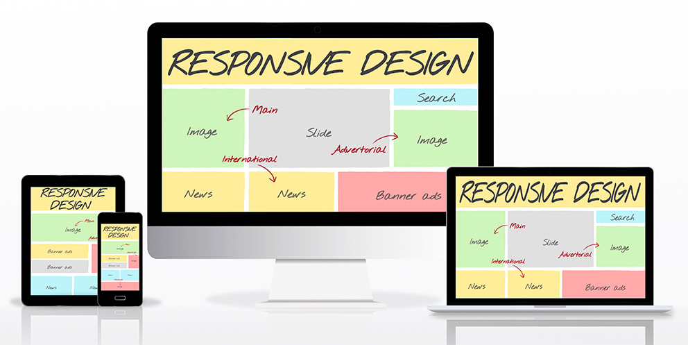
Imagine a website that effortlessly transforms itself, morphing its layout and content to perfectly fit any screen size, from a colossal desktop monitor to a pocket-sized smartphone. That’s the magic of responsive web design! It ensures users, regardless of their device of choice, can engage and interact with your website seamlessly, fostering a positive and lasting impression.
Why Responsive Web Design Reigns Supreme
In today’s digital arena, where mobile reigns and user experience is paramount, responsive web design isn’t just a trend; it’s a necessity. Here are some compelling reasons why RWD deserves a place of honor in your web development strategy:
- Unmatched User Experience (UX): A responsive website provides a consistent and enjoyable experience across all devices. Users can navigate menus with ease, access information effortlessly, and engage with interactive elements seamlessly, regardless of the screen size. This translates to higher user satisfaction, increased engagement, and ultimately, a thriving online presence.
- Search Engine Optimization (SEO) Champion: Google and other search engine giants prioritize responsive websites in their rankings. This means a responsive website has a higher chance of appearing on the coveted first page of search results, leading to increased organic traffic and brand visibility. In simpler terms, RWD helps your website get discovered by the right audience, boosting your online reach.
- Reduced Maintenance Costs: Gone are the days of managing separate mobile and desktop versions of your website. Responsive design allows you to maintain a single codebase that adapts to different devices, saving you precious time, resources, and the inevitable headaches associated with maintaining multiple versions.
- Future-Proofing Your Digital Space: Technology is ever-evolving, and new devices with varying screen sizes and functionalities are constantly emerging. A responsive website adapts to these changes, ensuring your online presence remains relevant, accessible, and user-friendly for years to come.
Related Article: Avoiding Common Mistakes in Responsive Web Design
Chapter 2: Building the Responsive Web Design Foundation: Essential Techniques
Now that you’ve grasped the importance of RWD, let’s delve into the core techniques that make it all work seamlessly:
- Fluid Grid Layouts: Ditch the rigid pixel-based layouts of yesteryear. Fluid grid layouts utilize percentages instead of fixed pixel values, allowing the website’s structure to adapt proportionally to various screen sizes. Think of it as a flexible web of columns and rows that can adjust and rearrange themselves based on the available space, ensuring a visually pleasing and functional website on any device.
- Media Queries: The Masters of Device Detection: Media queries are the unsung heroes of responsive web design. These CSS statements act as intelligent detectors, identifying the characteristics of the user’s device, such as screen size or orientation. Based on this information, media queries apply specific styles and layouts, ensuring optimal website rendering on different devices.
- Flexible Images: Adapting to Any Canvas: Images are integral components of most websites, but what happens when a high-resolution desktop image encounters a tiny smartphone screen? Pixelation and distorted visuals are not the answer. Responsive design utilizes flexible images – images that can resize and adapt to the available space without compromising quality or visual appeal. This ensures that images load quickly and display beautifully on all devices.
- Responsive Typography: Ensuring Readability Across Screens: Text plays a critical role in conveying information and engaging users. Responsive typography ensures that text sizes and font weights adjust appropriately for different screen sizes. Imagine comfortable reading experiences on desktops and smartphones – that’s the power of responsive typography in action.
Related Article: The Power of Responsive Web Design in E-commerce
Chapter 3: Best Practices for Responsive Web Design Mastery
While mastering the core techniques forms the foundation of responsive web design, adhering to best practices elevates your website from good to great:
Mobile-First Mentality:
In today’s mobile-centric world, prioritize design for smaller screens with limited bandwidth. Think about how menus will navigate, content will stack, and buttons will function on a smartphone screen first. This ensures a seamless mobile experience, which can then be enhanced for larger screens.
Progressive Enhancement: Building a Solid Foundation:
Responsive web design allows for a layered approach. Start with a basic HTML structure that functions flawlessly on all devices. Then, progressively add enhancements like complex layouts, interactive elements, and high-resolution visuals for larger screens. This ensures a solid foundation that everyone can access and a delightful experience for those with more powerful devices.
Testing, Testing, One-Two-Three:
A website might look stunning on your development machine, but how does it fare in the real world? Rigorous testing is paramount. Use a combination of device emulators, browser developer tools, and real-world testing on a wide range of devices and browsers. This meticulous approach helps identify and rectify any inconsistencies or issues, ensuring a seamless experience for all users.
Performance Optimization: Speed is King:
In today’s fast-paced world, users have little patience for slow loading websites. Responsive design doesn’t give you a free pass on performance. Optimize images, minify code, and leverage caching mechanisms to ensure your responsive website loads quickly on all devices, especially those with limited bandwidth.
Embrace the Future: Flexibility is Key:
The digital landscape is constantly evolving. New devices with unique capabilities and screen sizes are emerging all the time. By adhering to responsive design principles and utilizing flexible layouts and media queries, you create a website that readily adapts to these changes. This ensures your online presence remains future-proof, relevant, and accessible for years to come.
Chapter 4: Zimex Apex: Your Responsive Web Design Partner
The world of responsive web design can seem intricate, but you don’t have to navigate it alone. At Zimex Apex, a leading digital marketing agency, we understand the power of a responsive website and its impact on your online success.
Our team of experienced web developers and designers are passionate about crafting beautiful, user-friendly, and responsive websites that not only captivate users but also drive business results. We collaborate closely with you to understand your unique vision, target audience, and brand identity.
Here’s how Zimex Apex empowers your responsive web design journey:
- Strategic Planning: We work with you to define your website’s goals and target audience, ensuring your responsive design strategy aligns with your overall digital marketing objectives.
- Expert Design & Development: Our team leverages the latest responsive design techniques and best practices to create a website that adapts seamlessly across all devices.
- Performance Optimization: We prioritize website speed and performance, ensuring a smooth and enjoyable user experience regardless of the device used.
- Content Strategy Integration: We ensure your website’s content is optimized for responsive layouts and delivers a clear, consistent message across all devices.
- Ongoing Support & Maintenance: We don’t just build your website; we also provide ongoing support and maintenance to ensure it remains secure, up-to-date, and continues to deliver optimal user experiences.
Embrace Responsive Web Design with Zimex Apex
By partnering with Zimex Apex, you gain more than just a responsive website; you gain a team of digital marketing experts dedicated to your online success.
Contact Zimex Apex today and embark on your journey towards a responsive website that empowers your online presence, enhances user experience, and propels your digital marketing efforts to new heights.
Bonus Chapter: A Glimpse into the Future of Responsive Web Design
The future of responsive web design is brimming with exciting possibilities. Here are some trends to keep an eye on:
- Voice Search Optimization: With the rise of voice assistants like Siri and Alexa, websites will need to adapt to voice search queries. This might involve optimizing content for natural language and ensuring a smooth voice-driven user experience.
- Foldable Devices: Foldable smartphones and tablets are gaining traction. Responsive design will need to evolve to accommodate these unique screen configurations and user interactions.
- Artificial Intelligence (AI) Integration: AI-powered tools can personalize the user experience on responsive websites, tailoring content and layouts based on individual user preferences and browsing habits.
By staying informed about these emerging trends and partnering with a forward-thinking digital marketing agency like Zimex Apex, you can ensure your responsive website remains at the forefront of the ever-evolving digital landscape.
Chapter 5: Beyond the Basics: Advanced Responsive Web Design Techniques
While the core principles of responsive web design remain constant, there are advanced techniques that can elevate your website from good to exceptional. Here are some additional considerations for the truly design-savvy:
Responsive Breakpoints: Defining the Landscape:
A responsive website doesn’t magically adapt to every possible screen size. Instead, developers define specific breakpoints – points at which the website’s layout and styles change significantly to optimize for different device categories. Common breakpoints might include:
- Desktop (Large Screens): 1200px and above
- Tablet (Medium Screens): 768px to 1199px
- Mobile (Small Screens): Below 768px
These are just examples, and the ideal breakpoints for your website will depend on your target audience and the content you present.
Media Features Beyond Screen Size:
Media queries go beyond simply detecting screen size. They can also target other device characteristics like orientation (portrait vs. landscape) and resolution (high-definition vs. standard definition). This allows for even more fine-grained control over how your website adapts to different viewing environments.
CSS Grid and Flexbox: Powerful Layout Tools:
CSS Grid and Flexbox are powerful layout tools that offer more flexibility and control for responsive design compared to traditional methods. Grid allows for precise positioning of elements on a grid-like system, while Flexbox enables flexible layouts that adapt to different screen sizes by resizing and rearranging elements as needed.
Responsive SVGs (Scalable Vector Graphics):
Scalable Vector Graphics (SVGs) are a fantastic option for responsive design because they can be resized without losing quality. This is particularly useful for logos, icons, and other graphical elements that need to adapt to different screen sizes while maintaining visual clarity.
Responsive Menus: Navigation Reinvented:
Menus play a crucial role in website navigation, and they need to adapt seamlessly on different devices. Responsive design techniques like media queries and JavaScript can be used to create menus that change their appearance and functionality based on screen size. For example, a horizontal menu on a desktop might transform into a collapsible hamburger menu on a mobile device.
Progressive Web Apps (PWAs): Blurring the Lines:
Progressive Web Apps (PWAs) are web applications that offer app-like features and functionality while remaining accessible through a web browser. This can be particularly beneficial for responsive design, as PWAs can provide a more immersive and engaging user experience across all devices.
Chapter 6: Conclusion: The Power of Responsive Web Design in Your Hands
Responsive web design is no longer a luxury; it’s a necessity in today’s digital landscape. By implementing the principles and techniques outlined in this comprehensive guide, you can create a website that caters to users on all devices, fostering a positive user experience, boosting search engine rankings, and ultimately driving business success.
Remember, a responsive website is an investment in your online future. It’s a testament to your commitment to user experience and a reflection of your brand’s professionalism and forward-thinking approach.
Don’t Go It Alone: Partner with Zimex Apex
At Zimex Apex, we understand the complexities of responsive web design and its significant impact on your digital marketing efforts. Our team of skilled professionals is here to guide you through every step of the process, from strategic planning and user experience design to technical implementation and ongoing maintenance.
Contact Zimex Apex today and let us help you craft a responsive website that empowers your online presence, engages your audience, and propels your brand to new heights.
Take the first step towards a responsive future. We’re here to help!