Imagine walking into a room painted a vibrant red. Your heart rate might quicken, your energy levels might rise, and a sense of urgency might wash over you. Now, picture yourself in a tranquil blue room. You might feel calmer, more relaxed, and perhaps even a sense of peacefulness settles in. These are just two examples of how color, a seemingly simple element, can significantly impact our emotions and perceptions. In the realm of graphic design, color transcends mere aesthetics; it becomes a powerful tool that shapes brand identities, influences user experiences, and ultimately, speaks a universal language to your audience.
This comprehensive guide delves into the fascinating world of color psychology in graphic design. We’ll explore the emotional spectrum of colors, their cultural connotations, and how understanding these nuances empowers graphic designers to craft impactful visuals. By the end of this journey, you’ll gain valuable insights into how color can be strategically used to engage your audience, strengthen your brand message, and ultimately achieve your design goals.
A Journey Through the Rainbow: The Emotional Spectrum of Colors
The visible spectrum boasts a vast array of colors, each with its own unique personality. Understanding these personalities, the emotions they evoke, and the associations they hold is crucial for a graphic designer. Let’s embark on a color exploration, dissecting the psychology of primary, secondary, and tertiary colors:
Primary Colors:
- Red: The fiery red pulsates with energy, passion, excitement, and even danger. It’s often used to grab attention, stimulate the appetite (think fast food chains!), and evoke a sense of urgency (think sale signs!). However, overuse of red can create feelings of aggression or anxiety.
- Blue: The calming blue evokes feelings of serenity, trust, security, and peace. It’s a natural choice for promoting relaxation (think spa websites!), lowering blood pressure, and creating a sense of stability (think financial institutions!). However, excessive blue can portray coldness or a lack of warmth.
- Yellow: The sunshine yellow radiates happiness, optimism, creativity, and warmth. It’s a color that stimulates mental alertness, elevates mood, and fosters a sense of cheerfulness. It’s commonly used in children’s products and educational materials. However, an overabundance of yellow can create feelings of frustration or overwhelm.
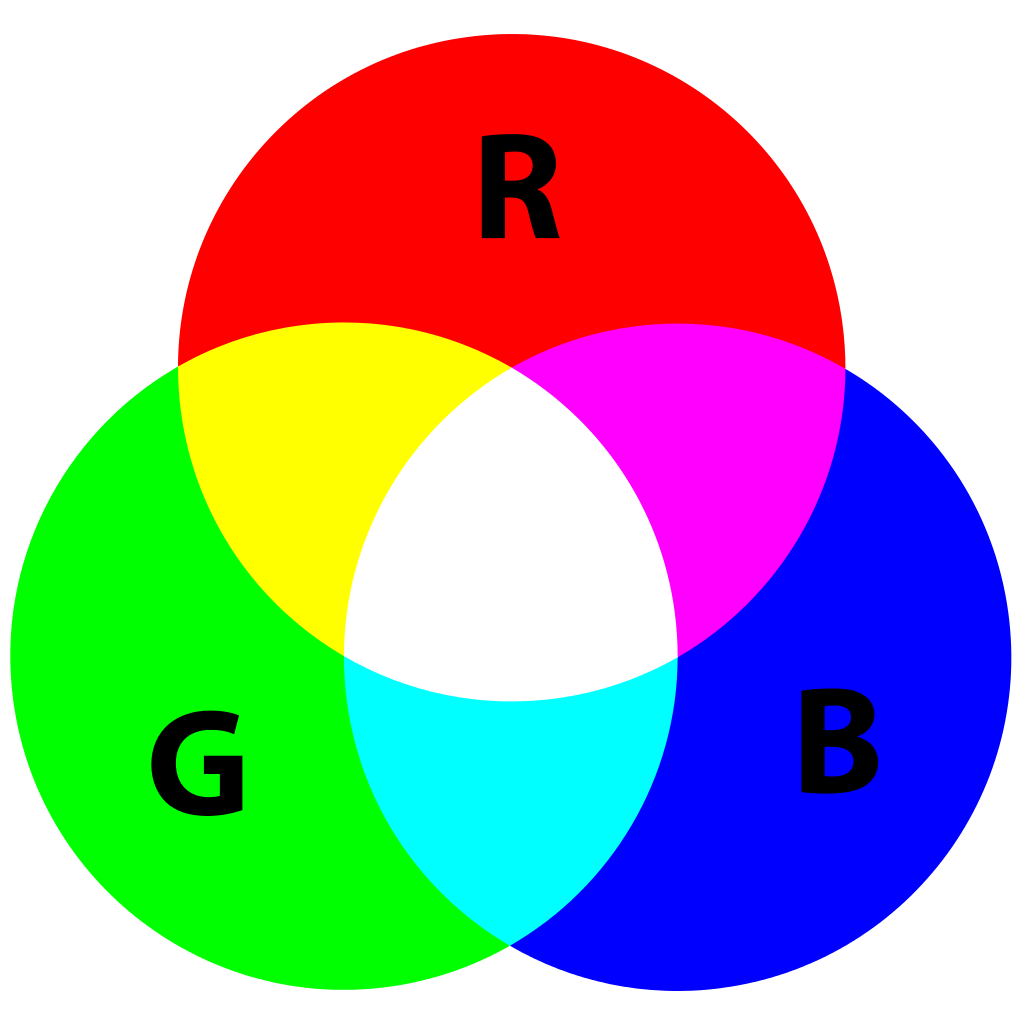
Secondary Colors:
- Orange: A vibrant blend of red’s energy and yellow’s warmth, orange embodies enthusiasm, adventure, and friendliness. It’s a color that encourages social interaction, promotes optimism, and stimulates creativity. Orange is often used in the design of sports equipment, children’s toys, and social media platforms.
- Green: The verdant green symbolizes nature, growth, harmony, and freshness. It promotes feelings of tranquility, balance, and environmental consciousness. Green is a popular choice for promoting eco-friendly products, health and wellness brands, and financial institutions seeking to convey stability. However, too much green can evoke feelings of stagnation or boredom.
- Purple: The luxurious purple exudes sophistication, creativity, mystery, and royalty. It evokes feelings of elegance, imagination, and a touch of the extraordinary. Purple is often used in high-end products, beauty brands, and marketing materials targeting a sophisticated audience. However, overuse of purple can create feelings of arrogance or aloofness.
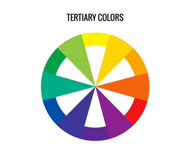
Tertiary Colors:
These captivating hues are formed by mixing primary and secondary colors, offering a wider palette for graphic designers. Each tertiary color inherits characteristics from its parent colors, resulting in a nuanced spectrum of emotions:
- Teal: A calming blend of blue and green, teal evokes feelings of tranquility, trust, and professionalism. It’s a versatile color used in technology brands, healthcare marketing, and travel websites.
- Turquoise: A refreshing mix of blue and green, turquoise embodies peace, serenity, and a touch of rejuvenation. It’s a natural choice for promoting spa treatments, vacation destinations, and eco-friendly products.
- Magenta: A vibrant fusion of red and purple, magenta radiates creativity, energy, and a touch of boldness. It’s often used in design-focused industries, fashion brands, and youth-oriented marketing materials.
- Maroon: A deep blend of red and brown, maroon evokes feelings of luxury, sophistication, and stability. It’s a popular choice for high-end products, financial institutions, and educational institutions.
This exploration is merely a glimpse into the vast emotional landscape of colors. Remember, cultural contexts can influence color perception. For instance, red symbolizes good luck in China but danger in some Western cultures.
The Art of Color Harmony: Creating Cohesive Palettes
With a multitude of colors at their disposal, graphic designers must master the art of creating color palettes that are both aesthetically pleasing and emotionally resonant. Here are some key considerations for crafting harmonious Color harmony refers to the arrangement of colors that creates a visually pleasing and balanced composition. Here are some key considerations for crafting harmonious color palettes for your graphic design projects:
- Color Wheel Theory: The color wheel serves as a fundamental tool for graphic designers. It visually organizes primary, secondary, and tertiary colors, showcasing their relationships and potential harmonies.
- Complementary Colors: Colors positioned directly opposite each other on the color wheel create a high-contrast, vibrant palette. This can be visually striking but requires careful use to avoid overwhelming viewers.
- Analogous Colors: Colors situated next to each other on the color wheel offer a harmonious and calming palette. This approach creates a cohesive and unified look.
- Triadic Colors: Three colors equidistant on the color wheel form a dynamic and engaging palette. This can be visually interesting but requires balancing the intensity of each color.
- Tetradic Colors: Four colors forming a rectangle on the color wheel create a vibrant and playful palette. This approach can be bold but necessitates careful manipulation to avoid appearing cluttered.
- Color Temperature: Colors can be categorized as warm (reds, oranges, yellows) or cool (blues, greens, violets). Strategic use of color temperature can evoke specific emotions. Warm colors create a sense of energy and excitement, while cool colors promote feelings of calmness and serenity. You can leverage this concept to create a specific mood or atmosphere in your design.
- Color Saturation and Value: Saturation refers to the intensity of a color, while value refers to its lightness or darkness. Utilizing a range of saturation and value levels within your palette adds depth and visual interest to your design.
Color Palettes in Action: Examples from the Real World
- Fast Food Chains: Take a look at the red and yellow color schemes of McDonald’s and KFC. These warm colors stimulate the appetite and evoke a sense of excitement, encouraging impulsive decisions.
- Tech Companies: Notice how tech giants like IBM and Facebook utilize blue color palettes. These cool colors convey trust, security, and stability, essential qualities for brands dealing with sensitive data.
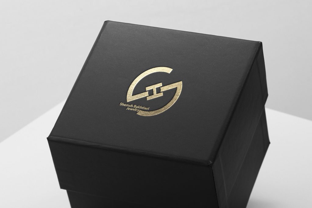
- Luxury Brands: Observe the prevalence of black, white, and gold in luxury brands like Chanel, Shemsh jewelry and Tiffany & Co. These colors exude sophistication, elegance, and a touch of exclusivity, aligning perfectly with the brand image.
The Power of Color Psychology in User Experience (UX)
Beyond aesthetics, color psychology plays a significant role in influencing user experience (UX) design. Colors can guide users through a website or app, highlight important elements, and ultimately shape their digital journey. Here are some key considerations:
- Clarity and Readability: Ensure adequate contrast between text and background colors for optimal readability. Avoid light text on a light background or dark text on a dark background.
- Call to Action (CTA): Use colors that draw attention to CTAs, such as buttons or links. Red, orange, and yellow are often effective choices for CTAs as they evoke a sense of urgency and encourage clicks.
- Navigation: Utilize color to subtly guide users through your website or app. For instance, you can highlight navigation elements with different colors to make them easily discoverable.
Related Article: Unveiling the Magic: How Psychology Transforms UI/UX Design
Cultural Considerations: A Global Language with Local Dialects
Color can be a powerful communication tool, but it’s crucial to consider cultural contexts. The symbolism and emotions associated with colors can vary significantly across cultures. Here are some examples:
- Red: In Western cultures, red symbolizes love and passion, but in China, it represents good luck and prosperity.
- White: In Western cultures, white signifies purity and innocence, but in some Asian cultures, it represents mourning.
- Black: In Western cultures, black can portray sophistication and luxury, but in some African cultures, it represents mourning or death.
By acknowledging these cultural variations, graphic designers can ensure their color choices resonate with their target audience and avoid unintentional misinterpretations.
Unlocking the Power of Color with Zimex Apex
At Zimex Apex, our team of experienced graphic designers leverages the power of color psychology to craft visually impactful and emotionally resonant designs. We understand the emotional weight of colors and their cultural nuances. Throughout the design process, we meticulously consider color choices to ensure they:
- Align with your brand identity: We translate your brand personality and values into a cohesive color palette and logo that resonates with your target audience.
- Elevate user experience: We use color strategically to guide users through your website or app, enhancing user experience and driving desired actions.
- Evoke the desired emotions: We understand the emotional impact of colors and tailor our color choices to evoke the specific feelings you want your audience to experience.
Related Article: The Enduring Power of a Logo: A Comprehensive Guide to Building Your Brand’s Visual Identity
Our color psychology expertise manifests in a wide range of graphic design services, including:
- Brand identity development: We create a unique and memorable brand identity through strategic color selection, ensuring your brand stands out in a crowded marketplace.
- Website design and development: We craft user-centric websites that leverage color psychology to optimize navigation, enhance user engagement, and drive conversions.
- Marketing materials design: We design compelling marketing materials, such as brochures, flyers, and social media graphics, that utilize color effectively to capture attention and communicate your brand message clearly.
- Product packaging design: We create packaging designs that grab attention on store shelves, utilize color strategically to convey product attributes, and influence purchasing decisions.
- Social media graphics design: We design eye-catching social media graphics that leverage color psychology to increase engagement, generate likes and shares, and build brand awareness.
- Infographics design: We create informative and visually appealing infographics that use color effectively to highlight key data points, simplify complex information, and improve knowledge retention.
Partnering with Zimex Apex empowers you to:
- Harness the power of color psychology: Our team of experts will guide you through the color selection process, ensuring your brand leverages color effectively to achieve your design goals.
- Strengthen brand recognition: A well-defined color palette helps create a consistent and recognizable brand image across all your marketing materials.
- Connect with your audience on an emotional level: Color can evoke powerful emotions, and by using it strategically, you can create designs that resonate deeply with your target audience, fostering brand loyalty and trust.
- Increase engagement and conversions: Strategic use of color can guide users through your website or app, attract attention to CTAs, and ultimately drive desired actions.
Ready to Unlock the Power of Color in Your Designs?
Contact Zimex Apex today for a free consultation. Let our team of experienced graphic designers help you harness the power of color psychology to create impactful and emotionally resonant designs that elevate your brand, engage your audience, and achieve your marketing goals. Remember, color is a powerful tool in the graphic designer’s arsenal. By understanding its influence and leveraging the expertise of Zimex Apex, you can unlock its potential and create designs that not only look stunning but also speak volumes to your target audience.