Surfing the Mobile Wave
The digital landscape is no longer a static beach – it’s a dynamic ocean constantly reshaped by the tides of technological innovation. In this ever-evolving sea, the rise of mobile and tablet devices has been nothing short of a tsunami, fundamentally altering how users navigate the online world. This article dives deep into the transformative impact of the mobile revolution on internet usage, highlighting the essential role of responsive web design in this new era. We’ll also explore the potential pitfalls of neglecting mobile optimization, ultimately demonstrating why prioritizing responsive web design is the anchor you need to secure long-term digital success.
Thank you for reading this post, don't forget to subscribe!Thank you for reading this post, don't forget to subscribe!The Stats Don’t Lie: The Mobile and Tablet Takeover
The proliferation of mobile and tablet devices isn’t a fad – it’s a fundamental shift in user behavior. Over 50% of global internet traffic now originates from mobile devices, a staggering statistic that underscores the necessity of adapting to diverse screen sizes and resolutions. Users today expect a seamless and intuitive experience across all devices, from desktop computers to smartphones. Businesses that fail to cater to this mobile-first world risk getting swept away by the current.
Responsive Design: Your Lifeguard in the Digital Ocean
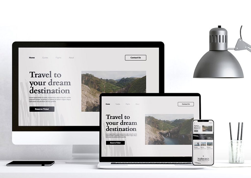
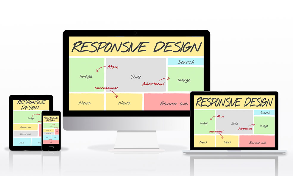
Responsive web design emerges as the lifeguard in this scenario, offering a versatile solution to meet the needs of modern users. Imagine a website that dynamically adjusts its layout and content based on the screen size and orientation of the device accessing it. That’s the magic of responsive design – it ensures optimal user engagement and satisfaction across all platforms. Here’s why responsive design is your ticket to a thriving online presence:
Enhanced User Experience: Putting Users First
Responsive websites prioritize user experience (UX) above all else. They offer intuitive navigation, lightning-fast loading times, and content that’s optimized for each device. By eliminating frustration and friction, responsive design fosters positive interactions and encourages users to stay engaged for longer. Imagine the difference between navigating a cluttered website on your phone and one that seamlessly adapts to your screen. That’s the power of responsive web design in action.
SEO Champions: Climbing the Search Engine Rankings
Search engines like Google prioritize mobile-friendly websites in their algorithms, propelling them to higher rankings and driving increased organic traffic. Responsive design ensures your website is accessible and user-friendly across all devices, maximizing visibility and reach. Think of it as climbing the search engine mountain – responsive design provides the sturdy ropes and tools you need to reach the peak.
Conversion Rate Champions: Turning Visits into Victories
A seamless user experience paves the way for higher conversion rates. Responsive websites facilitate frictionless interactions, guiding users seamlessly through the conversion funnel. Whether it’s a purchase, a sign-up, or a download, responsive design removes roadblocks to conversion, ultimately maximizing the likelihood of user action and driving business growth.
The Dark Side of Neglect: Why Non-Responsive Design Sinks Businesses
Failing to prioritize responsive design can have detrimental consequences. Let’s explore the potential pitfalls you might encounter:
Missed Opportunities: Leaving Money on the Table
Non-responsive websites alienate mobile users, leading to a significant loss of potential customers and missed opportunities for engagement and conversion. In a mobile-first world, neglecting mobile optimization can translate to significant revenue loss and a shrinking market share. Don’t let your business become a shipwreck on the shores of mobile neglect.
Search Engine Graveyard: Buried by the Competition
Search engines penalize non-responsive websites, relegating them to the lower depths of search engine results pages (SERPs). This dramatically diminishes visibility and reduces organic traffic, limiting your potential for growth and expansion. Responsive design is your life raft in this scenario – it keeps your website afloat and visible in the vast sea of online competition.
Frustrated Users, Damaged Reputation: A Sinking Ship
Non-responsive websites often deliver subpar user experiences on mobile devices, leading to frustration and dissatisfaction among users. This can damage your brand reputation and erode customer loyalty, ultimately hindering business success. Remember, happy users are loyal users, and responsive design is the key to keeping them happy on any device.
Beyond the Basics: The Added Benefits of Responsive Web Design
Responsive design offers a treasure trove of benefits that extend beyond the core advantages we’ve discussed:
Enhanced Brand Reputation: Building Trust Through Design
Responsive websites that provide a seamless experience across devices contribute to a positive brand image. Users associate responsive design with professionalism, reliability, and user-centricity. This translates to enhanced brand reputation and fosters trust among potential customers. When someone visits your website on their phone and has a positive experience, they’re more likely to see your brand in a favorable light.
Accessibility for All: Embracing Inclusivity
Responsive design inherently improves accessibility for users with disabilities. By ensuring that websites are compatible with assistive technologies and adaptable to different user needs, businesses demonstrate their commitment to inclusivity and compliance with accessibility standards. In today’s diverse digital landscape, catering to a wider audience is not just good practice, it’s essential for long-term success.
Competitive Advantage: Riding the Wave of Innovation
In the ever-changing digital landscape, responsive web design is no longer a luxury – it’s a necessity. Businesses that invest in responsive design gain a competitive edge by staying ahead of the curve and meeting the evolving expectations of consumers. A mobile-friendly website can differentiate your brand from competitors who are still clinging to outdated desktop-centric designs. Remember, users today expect a seamless mobile experience, and responsive design is the key to delivering it.
Adaptability to Future Technologies: A Design for All Seasons
Responsive design provides a future-proof solution that adapts to emerging technologies and devices. As new devices with varying screen sizes and capabilities enter the market, responsive websites can easily accommodate these changes without requiring significant redesign or redevelopment. This flexibility ensures that businesses remain agile and adaptable in the face of technological advancements. The mobile landscape is constantly evolving, and responsive design ensures your website can weather any storm.
Seamless Multichannel Experience: A Consistent Brand Experience
Responsive design enables businesses to deliver a consistent brand experience across multiple channels and devices. Whether a user accesses your website from a desktop computer, smartphone, or tablet, they can expect a cohesive and unified experience that reinforces brand identity and messaging. Imagine a user seeing your social media ad on their phone, clicking through to a landing page, and having a seamless experience – that’s the power of responsive design in action.
Data-Driven Insights: Making Informed Decisions
Responsive design allows businesses to gather valuable data and insights about user behavior across different devices. By analyzing metrics such as bounce rates, conversion rates, and device usage patterns, businesses can identify areas for improvement and optimize their digital strategies accordingly. This data-driven approach empowers businesses to make informed decisions and continually refine their online presence to better meet the needs of their target audience. It’s like having a treasure map to your audience’s online behavior, allowing you to optimize your website for maximum impact.
Cost-Effectiveness: Saving Money While Looking Great
Investing in responsive design offers long-term cost savings compared to maintaining separate desktop and mobile websites. Responsive websites require less maintenance and upkeep, as updates and changes only need to be implemented once for all devices. Additionally, responsive web design reduces development costs by streamlining the design and development process. It’s a win-win – you get a great-looking website that saves you money in the long run.
Global Reach: Expanding Your Market Without Limits
With the widespread adoption of mobile devices, responsive design enables businesses to reach a global audience more effectively. Whether users are accessing the website from different countries or regions, responsive websites ensure a consistent and optimized experience regardless of geographic location. This global reach can open up new markets and opportunities for expansion, driving business growth and revenue. Don’t limit yourself to a local audience – responsive design lets you cast a wider net and attract users from around the world.
Social Media Integration: A Match Made in Digital Heaven
Responsive design seamlessly integrates with social media platforms, allowing businesses to leverage these powerful channels to drive traffic and engagement. Whether users are accessing content through a social media app or sharing links on mobile devices, responsive websites ensure that the user experience remains consistent and engaging. This integration enhances brand visibility and encourages social sharing, amplifying the reach and impact of your digital marketing efforts. Social media is a goldmine for user engagement, and responsive design ensures your website is ready to capitalize on it.

Responsive Web Design – Your Digital Anchor
In summary, responsive design offers a treasure trove of benefits for businesses looking to maximize their digital impact in the mobile era. From improving user experience and SEO performance to reducing costs and reaching a global audience, responsive design is essential for staying competitive and achieving business objectives. At Zimex Apex, we specialize in creating responsive and user-friendly websites that drive results. Contact us today to learn how we can help you elevate your online presence and achieve your digital marketing goals. Remember, in the ever-changing digital ocean, responsive design is your anchor, keeping your website afloat and ensuring you reach your destination of success.