
In the digital age, where attention spans are shorter than ever and competition is fierce, creating a website that captures user attention and compels action is paramount. While high-quality visuals, compelling content, and intuitive navigation all play a vital role, there’s an often-overlooked hero in the world of web design: white space.
Often perceived as mere emptiness, white space, also known as negative space, is the carefully considered use of empty areas between elements on a webpage. It’s not just the absence of color or content; it’s a strategic design tool that significantly impacts the visual hierarchy, user experience, and overall effectiveness of your website.
This comprehensive guide dives deep into the power of white space in web design. We’ll explore its various benefits, delve into effective white space techniques, and showcase real-world examples that illustrate its transformative potential. By the end, you’ll be equipped with the knowledge and inspiration to harness the power of white space and create websites that not only look stunning but also convert visitors into loyal customers.
| Related Post: |
|---|
| If you enjoyed this article, you might also be interested in Mastering UX for Customer Experience. |

The Many Benefits of White Space
Integrating ample white space into your web design strategy unlocks a treasure trove of advantages, both aesthetic and functional. Here are some key benefits that will elevate your website:
- Enhanced Visual Hierarchy: White space establishes a clear visual hierarchy, guiding the user’s eye through the page and highlighting the most important elements. Imagine a cluttered room overflowing with furniture – it’s difficult to identify anything specific. By strategically placing white space around key elements like headlines, calls to action, and product images, you create breathing room and ensure users focus on the information you want them to see.
- Improved Readability: Generous white space surrounding text blocks significantly enhances readability. Adequate spacing between lines and paragraphs prevents text from appearing crammed and allows users to comfortably consume content without straining their eyes. This is especially crucial for mobile users who often browse on smaller screens.
- Clean and Modern Aesthetic: In today’s tech-savvy world, users appreciate clean, modern, and uncluttered interfaces. White space contributes significantly to this aesthetic by creating a sense of spaciousness and minimalism. This not only looks visually appealing but also conveys professionalism and sophistication, making your brand appear more trustworthy and credible.
- Enhanced Content Focus: By surrounding content with ample white space, you draw attention to the actual content, making it the focal point of the page. This prevents distractions from competing elements like flashy animations or overflowing menus, ensuring that visitors engage with the information you want them to see. This focused approach is particularly impactful for websites with storytelling elements or showcasing a specific product line.
- Responsive Design: White space plays a vital role in responsive design, the practice of ensuring your website adapts seamlessly to different screen sizes and devices. Ample white space prevents elements from overlapping or appearing cramped on smaller screens, maintaining a consistent user experience across all platforms.
- Improved User Experience: Beyond aesthetics, white space significantly impacts user experience (UX). A website with clear navigation, well-spaced text, and a clutter-free layout is easier to navigate, less overwhelming, and ultimately, more enjoyable to use. This, in turn, increases user engagement and reduces bounce rates (the percentage of visitors who leave a website after viewing only one page).
- Accessibility: White space can also enhance accessibility for users with visual impairments. By providing adequate contrast between text and background elements, you create a website that’s easier for everyone to navigate and consume information.
The Art of Using White Space Effectively
While the benefits of white space are undeniable, achieving the perfect balance is crucial. Too little white space can make the page feel cramped and overwhelming, while too much can evoke a sense of emptiness and lack of content. The key lies in finding the “sweet spot” that creates a visually appealing and user-friendly layout.
Here are some valuable tips to help you master the art of white space in web design:
- Understanding White Space Types: There are two primary types of white space: micro and macro. Micro white space refers to the small gaps between letters, lines of text, and elements within a single design block. Macro white space refers to the larger areas of empty space between sections, navigation menus, and content blocks. Both types play a crucial role in achieving a visually balanced and user-friendly design.
- Padding and Margins: Padding adds space around individual elements (like buttons or images) within a design block. Margins, on the other hand, add space between design blocks themselves. Adjusting these values allows you to fine-tune the spacing and create a sense of balance.
- Grid Systems: Grid systems provide a structured framework for arranging elements on a webpage. By employing a grid system, you can ensure consistent spacing and prevent your design from becoming cluttered. Grid systems offer flexibility, allowing you to create different column layouts for various content sections. Popular grid systems include the 12-column grid and the Golden Ratio grid.
- Hierarchy and Emphasis: Use white space strategically to create a visual hierarchy, guiding the user’s eye towards the most important elements on the page. This can be achieved by surrounding key elements, such as headlines and calls to action (CTAs), with more white space than supporting content. By creating a clear hierarchy, you ensure users focus on the information that drives conversions.
- Typography: Typography plays a significant role in website design, and white space is a key element in achieving optimal readability. Employ ample line spacing and letter spacing to improve readability and create a sense of airiness. Avoid overly condensed text blocks, as they can become visually overwhelming and difficult to read, especially on smaller screens.
- Visual Elements: Images, videos, and infographics are powerful tools for engaging users and conveying information. However, using too many visual elements or placing them too close together can create visual clutter. Use white space to balance out heavy visual elements, ensuring they stand out without overwhelming the user.
- Negative Space Around Calls to Action (CTAs): CTAs are crucial elements that drive user action, whether it’s subscribing to a newsletter, making a purchase, or downloading a white paper. By surrounding your CTA buttons with ample white space, you draw attention to them and increase their click-through rate (CTR).
- Section Breaks: Utilize white space to create clear section breaks, visually separating different sections of your webpage content. This improves scannability, allowing users to quickly grasp the overall structure and navigate to the information they seek.
- White Space and Content Length: The amount of white space you incorporate can depend on the length and density of your content. For shorter, more concise content blocks, you might use less white space to maintain a sense of flow and connection. On the other hand, longer content sections benefit from more white space to create breathing room and enhance readability.
- A/B Testing: A/B testing allows you to compare different design variations and determine which approach resonates best with your target audience. You can use A/B testing to explore the impact of different white space configurations on user engagement and conversion rates.
- Remember: White space is not a static element; it’s a dynamic tool that requires careful consideration and adjustment based on your specific content, website goals, and target audience. By experimenting with different techniques and finding the right balance, you can create a website that is both aesthetically pleasing and user-friendly.
Websites that Master White Space
To truly appreciate the transformative power of white space, let’s delve into some real-world examples of websites that masterfully utilize this design principle:
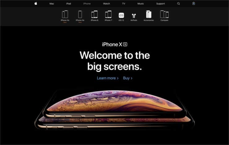
- Apple: Renowned for its minimalist approach, Apple’s website exemplifies the power of white space. They leverage ample white space to create a clean, sophisticated, and user-friendly experience. High-resolution product images are surrounded by generous white space, drawing user attention to the product’s design and functionality. The website prioritizes clear navigation and concise product descriptions, further emphasizing user-friendliness through the strategic use of white space.
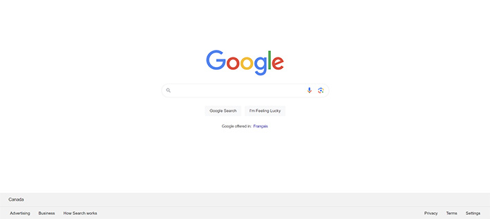
- Google: Google’s homepage is an iconic example of how white space can be used to focus user attention. The clean design features a single search bar surrounded by ample white space, emphasizing its primary function. This minimalist approach avoids distractions and encourages users to engage with the core service Google offers – searching the web.
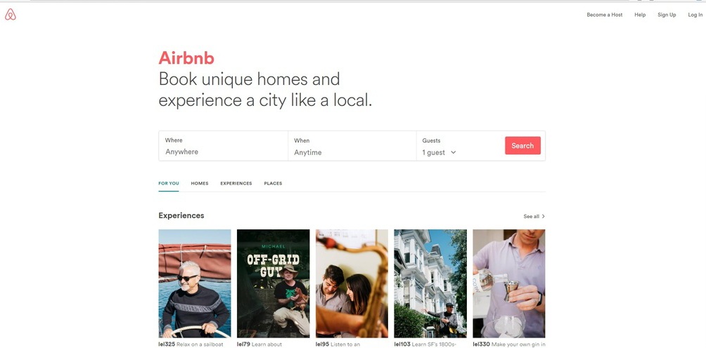
- Airbnb: Airbnb leverages white space to showcase stunning property photos and create a sense of spaciousness that aligns perfectly with their brand. They prioritize large, high-quality images, each surrounded by ample white space. This approach allows users to easily visualize themselves enjoying the properties listed on the platform. Airbnb also uses white space to create clear navigation menus and concise property descriptions, ensuring a smooth and enjoyable user experience.
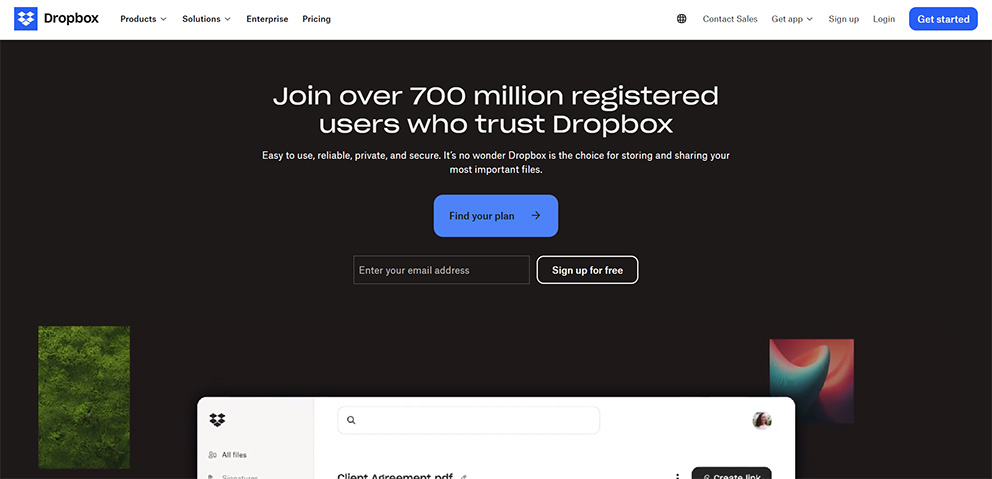
- Dropbox: Cloud storage service Dropbox utilizes white space to create a sense of simplicity and ease of use. Their website features clean lines, a clear value proposition, and ample white space surrounding key elements. This approach communicates the platform’s core functionality – storing and sharing files – in a clear and concise manner.
These are just a few examples of how leading brands harness the power of white space to create visually appealing, user-friendly, and effective websites.
The Impact of White Space on User Experience (UX)
The benefits of white space extend far beyond aesthetics. By incorporating ample white space into your web design, you can significantly enhance user experience (UX) in several ways:
- Improved Navigation: Clear navigation menus and well-spaced links are crucial for website usability. White space helps separate navigation elements, making them easier to identify and click on. This facilitates intuitive navigation, allowing users to find the information they seek quickly and efficiently.
- Enhanced Readability: As mentioned earlier, ample white space surrounding text blocks reduces eye strain and improves reading comprehension. This is particularly important for websites with content-heavy sections, such as blog posts or product descriptions. By making text easier to read, you encourage users to engage with your content and learn more about your brand.
- Reduced Cognitive Load: Cognitive load refers to the amount of mental effort required to process information. A cluttered website with overwhelming visuals and text creates a high cognitive load, making it difficult for users to understand content and complete desired actions. White space helps reduce cognitive load by minimizing distractions and presenting information in a clear and concise manner. This allows users to focus on the task at hand, whether it’s reading content, making a purchase, or filling out a form.
- Positive First Impression: A clean, modern, and user-friendly website using white space effectively creates a positive first impression on visitors. This impression is crucial for building trust and brand loyalty. Users are more likely to perceive a website with ample white space as professional, trustworthy, and easy to navigate. This positive first impression can significantly influence user behavior, encouraging them to explore further, engage with your content, and ultimately convert into paying customers.
- Accessibility for Diverse Users: White space plays a vital role in website accessibility. By providing adequate contrast between text and background elements, you create a website that’s easier for users with visual impairments to navigate and consume information. Additionally, ample white space can improve readability for users with dyslexia or other reading difficulties.
Incorporating white space into your web design demonstrates a commitment to user experience. It shows that you prioritize user needs and strive to create a website that’s not only visually appealing but also easy to understand and navigate. This focus on UX can lead to increased user engagement, improved conversion rates, and ultimately, a stronger online presence for your brand.
| Related Post: |
|---|
| If you enjoyed this article, you might also be interested in Unveiling Toronto’s Top 5 Web Design Trends for 2024. |

Zimex Apex: Your Partners in White Space Mastery
At Zimex Apex, a leading digital marketing agency, we understand the power of white space and its transformative impact on web design. Our team of experienced designers and developers possess a keen eye for balance and utilize white space strategically to create websites that resonate with users.
We don’t just design websites; we craft user experiences. Here’s how Zimex Apex can help you harness the power of white space:
- In-Depth Website Analysis: Our team will conduct a thorough analysis of your existing website or design concept, evaluating the use of white space and its impact on user experience.
- Strategic White Space Integration: We’ll work collaboratively with you to develop a white space strategy that aligns with your brand identity, target audience, and website goals. We’ll ensure the optimal use of micro and macro white space to create a visually balanced and user-friendly layout.
- A/B Testing and Optimization: We believe in data-driven design. We’ll conduct A/B testing to compare different white space configurations and determine which approach leads to the best user engagement and conversion rates.
- Responsive Design Expertise: Our team is skilled in responsive design, ensuring your website adapts seamlessly to different screen sizes and devices. We’ll utilize white space strategically to maintain a consistent and user-friendly experience across all platforms.
- Ongoing Support and Collaboration: We believe in building long-term partnerships with our clients. We’ll provide ongoing support and guidance to ensure your website continues to leverage the power of white space as your brand and content evolve.
Ready to transform your website and create a user experience that thrives?
Contact Zimex Apex today for a free consultation.
Let’s discuss your website goals and explore how we can harness the power of white space to create a website that not only looks stunning but also converts visitors into loyal customers.
By now, you’ve hopefully grasped the immense potential of white space in web design.
It’s not just about empty space; it’s a strategic tool that transforms websites from cluttered messes to visually appealing, user-friendly experiences that drive results.
Here’s a quick recap of the key takeaways:
- White space enhances visual hierarchy, improves readability, and creates a clean, modern aesthetic.
- It fosters content focus, facilitates responsive design, and ultimately, elevates user experience.
- By mastering white space, you can create websites that are not only beautiful but also functional and effective.
Are you ready to unlock the power of white space for your website?
If you’re looking to:
- Increase user engagement
- Boost conversion rates
- Strengthen your brand image
- Create a website that truly resonates with your target audience
Then look no further than Zimex Apex.
We are a passionate team of digital marketing experts who specialize in crafting exceptional user experiences. Our proven track record speaks for itself.
We’ve helped countless businesses leverage the power of white space to create websites that not only look stunning but also achieve their online marketing goals.


My website feels cluttered and overwhelming. Can white space really help?
Absolutely! White space, also known as negative space, is a strategic design element that can transform your website from cluttered to clear and user-friendly. By incorporating ample white space, you can improve readability, enhance visual hierarchy, and create a clean, modern aesthetic. This not only makes your website more visually appealing but also improves user experience (UX) and can lead to increased engagement and conversions.
How much white space is too much? I don’t want my website to look empty.
Finding the right balance is key. Too little white space creates a cluttered feel, while too much can appear empty. Zimex Apex can help! Our experienced designers will analyze your website and strategically integrate white space to create a visually balanced and user-friendly layout, ensuring your website feels spacious and inviting without appearing empty.
Is white space important for mobile responsiveness?
Yes! White space plays a vital role in responsive design, which ensures your website adapts seamlessly to different screen sizes and devices. By using white space strategically, we can prevent elements from overlapping or appearing cramped on smaller screens, maintaining a consistent and positive user experience across all platforms.
Can white space help improve conversions on my website?
Yes, white space can significantly impact conversions. By drawing attention to key elements like calls to action (CTAs) and product images, white space can increase their click-through rates and lead to more conversions. Additionally, a clean and user-friendly website with ample white space fosters trust and credibility, which can influence user behavior and encourage them to take action.